
Challenge
The SGS Life Sciences (LS) division was dealing with inconsistent internal and external brand communications, including imagery and messaging that was not clearly representing their product and service offerings. They were struggling with the concept of creating a message that would resonate with audiences in many different parts of the world. The division also faced several challenges such as the fact that many companies within the regulatory life sciences industry offer similar ranges of services.
Current Market
To compete in the market, SGS LS needed to distance their offerings from the competition and discourage consumers from buying based on price alone. But SGS LS was lacking clear communication that showed audiences how they were different and all the ways they could meet their needs. To accomplish this, we needed to create a differentiation that their target audiences would innately find relatable, believable and compelling.
Visually Confusing
SGS LS was using images of bees, beehives and flowers to convey the concept of a network, symbolic of their global network of labs. While this message was on point, the connection between the images and intended message was unclear and the delivery confusing to the local and international target markets.
Solution
Our main objectives for SGS LS were to establish an identity that was easily recognizable to their global audiences and that stakeholders internally and externally could relate to, improve communications and solidify their brand in the market, especially with their B2B client base.
It’s all in the research
In the development of our marketing recommendations, key messages, strategies and tactics, we surveyed SGS LS’ staff and clients, as well as performed extensive secondary market research in order to develop deep analyses of SGS LS’ strengths / weaknesses / opportunities / threats (SWOT), consumers, competitors, brand archetype and target markets. In doing so, FLD identified SGS LS’ audiences as Millennial researchers and scientists, as well as SME Biotech companies mostly run by and attracting Millennial talent. Most importantly, we discovered that these audiences have similar values and needs.
Building a clear identity
To create a powerful connection between SGS LS and its audiences, FLD created a unique brand archetype and identity which naturally aligned with SGS LS’ core values, as well as with those of the target audience while differentiating SGS LS from competitors. With this archetype in mind and utilizing demographic data, primary and secondary market/industry research, competitive analysis insights, as well as the core values and vision of SGS, we then developed marketing key messages and imagery.

Power of communication
Our communications objectives were to illustrate trust between the organization and its clients while helping the target markets instantly see what value SGS LS could bring to them.
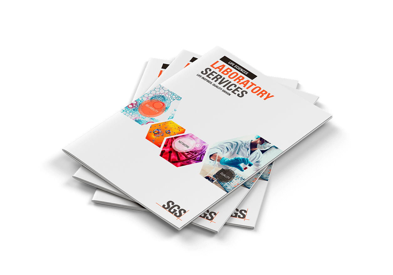
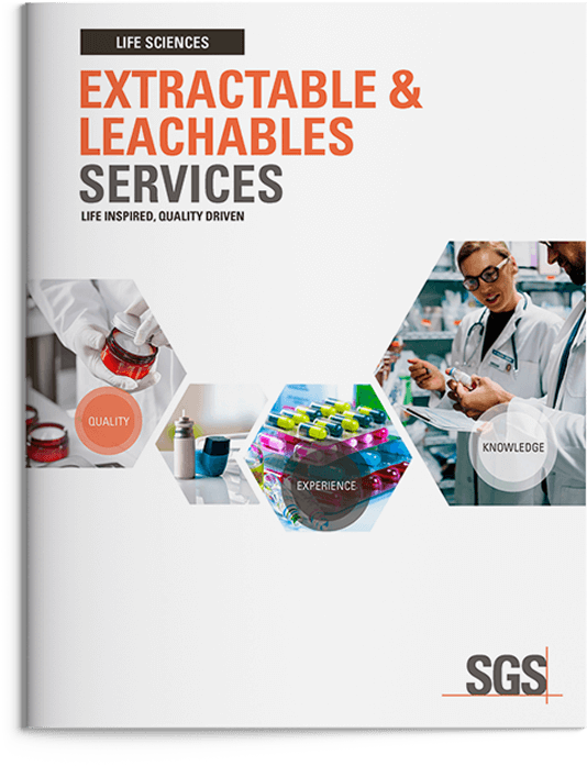
As part of the rebrand, FLD developed a tagline true SGS LS’ core values and reflective of the brand archetype, while also remaining in alignment with the values of the target markets. With the objective of being inspiring while delivering peace of mind and confidence to SGS LS’ stakeholders, the following tagline was chosen based on a series of internal survey results: Life Inspired, Quality Driven.
Completing it with visuals
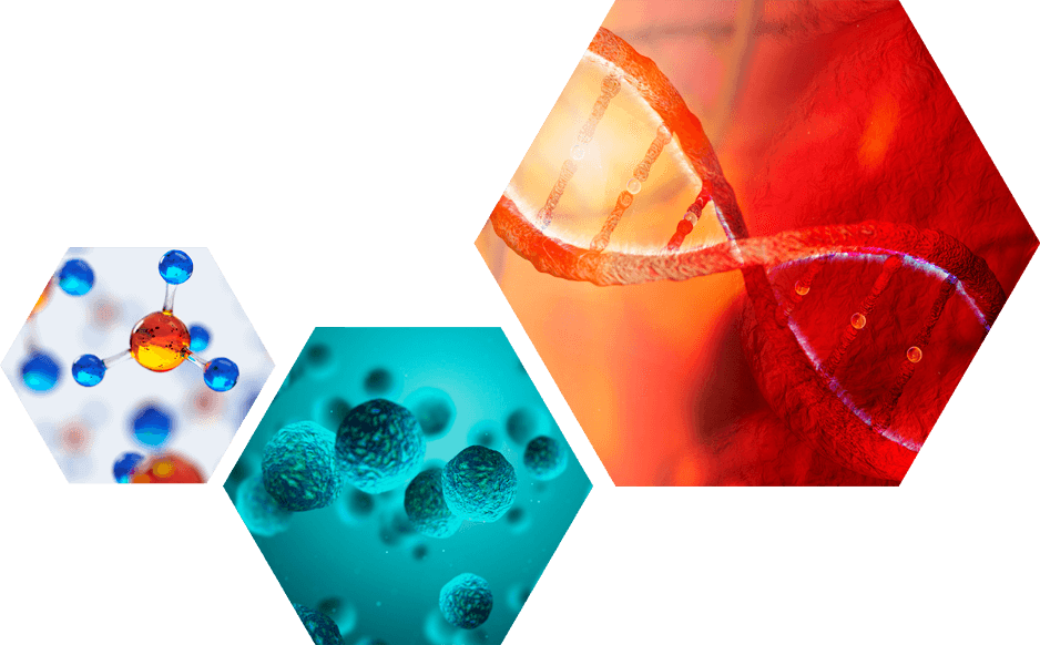
FLD carried over SGS LS’ use of the hexagon (found in their beehive imagery) into the new brand identity because it was a solid representation of their honeycomb philosophy; invoking the concept of a network (similar global network of labs and integrated services). The continued use of the hexagon from the previous branding imagery allowed us to illustrate SGS LS’ evolution as a brand and unwavering commitment to the values it built its reputation and success upon. The hexagon is also seen in the structure of DNA, making it instantly recognizable to SGS LS’ audiences of scientists and researchers.

A seamless transition
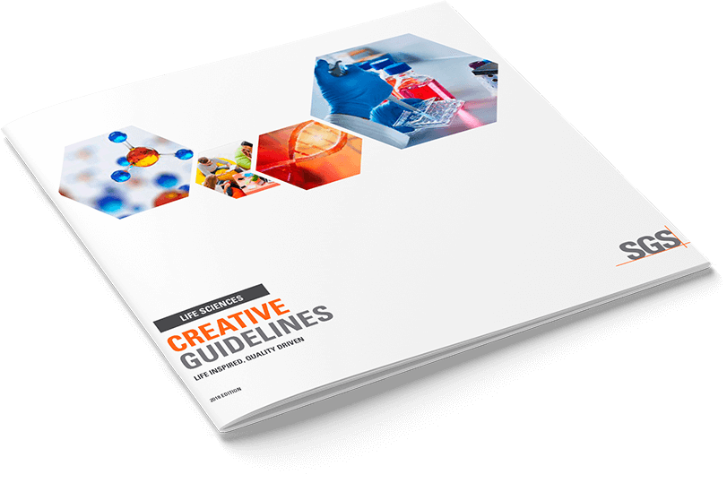
FLD composed a Creative Brand Guideline document that included colour pallets, fonts to use, etc., for SGS LS to use internally and externally when developing any future creatives.
Results
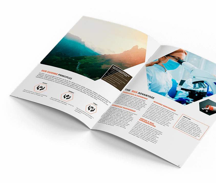
Utilizing the new brand identity, FLD developed and executed an integrated marketing campaign which was received very well by SGS Life Sciences’ audiences. By updating all marketing materials with new imagery and messaging that stands out and reaches audiences in a compelling way, SGS LS now delivers a consistent promotional message which has strengthened and streamlined their brand internally and externally and aided their sales teams in clearly communicate their value proposition to stakeholders. Successfully curbing the identity issues SGS LS was facing globally, they have improved communications overall and increased their brand reputation and positioning to grow demand for their services in the market.